

Color Me Festive: How to Use Color Theory in Holiday Packaging
When it comes to holiday packaging, color does more than decorate. It communicates. Whether it’s evoking a sense of mystery for Halloween, warmth for Thanksgiving, nostalgia for Christmas, or glamour for New Year’s, color theory plays a crucial role in how seasonal packaging makes customers feel.
In this blog post, we’re diving into the psychology of color and how brands can use (or reinvent) holiday color palettes to connect with their audiences. Let’s unwrap what works (and why) when it comes to each festive season.
Why Color Theory Matters in Seasonal Packaging
Color isn’t just a visual tool. It taps into emotion, memory, and even purchasing behavior. In the world of packaging, that makes it incredibly powerful. Especially during the holidays, colors carry specific cultural associations. Some timeless, some trending.
Understanding those associations and how to use them strategically can help your brand:
Stand out on the shelf or doorstep
Strengthen seasonal branding
Create emotional resonance with customers
Encourage impulse buys and gifting
Let’s break it down by holiday.
Halloween: The Bold and the Bewitching
Core Palette: Orange, black, purple, green
Psychology: Contrast, excitement, fear, fun
Halloween’s colors are some of the most iconic, and they’re all about contrast and mood.
Orange represents energy, harvest, and change, perfect for autumn and excitement.
Black speaks to mystery, darkness, and sophistication. It’s both spooky and stylish.
Purple and green are often used to signal the playful side of Halloween magic, potions, and a touch of mischief.

Packaging Tips:
High-contrast designs (like orange on black) grab attention instantly.
Matte black finishes paired with foil or UV gloss create a modern, luxe feel.
Neon versions of purple and green bring in a retro or nostalgic vibe.
Want something more unexpected? Try a minimalist Halloween palette using cream, tan, and dusty orange for a lighter effect.
Best for: Candy, beauty boxes, limited-edition seasonal items, novelty gifts.
Thanksgiving: Warm, Earthy, and Grateful
Core Palette: Brown, mustard yellow, burnt orange, burgundy, olive
Psychology: Comfort, tradition, abundance
Thanksgiving colors mirror the fall landscape and the emotional tones of gratitude and togetherness.
Brown and tan signify stability and natural simplicity.
Burnt orange, gold, and mustard suggest abundance and warmth.
Burgundy and deep reds add richness and sophistication.

Packaging Tips:
Use texture to your advantage: kraft paper, recycled cardboard, or linen finishes bring in an organic, farm-to-table feel.
Try a tonal palette using multiple shades of orange and red for a layered, cozy look.
Leaf motifs or natural illustrations can elevate without cluttering the design.
Metallic accents (like copper foil) add seasonal sparkle without veering into Christmas territory.
Best for: Food and beverage, farm-to-table products, gift boxes, hospitality kits.
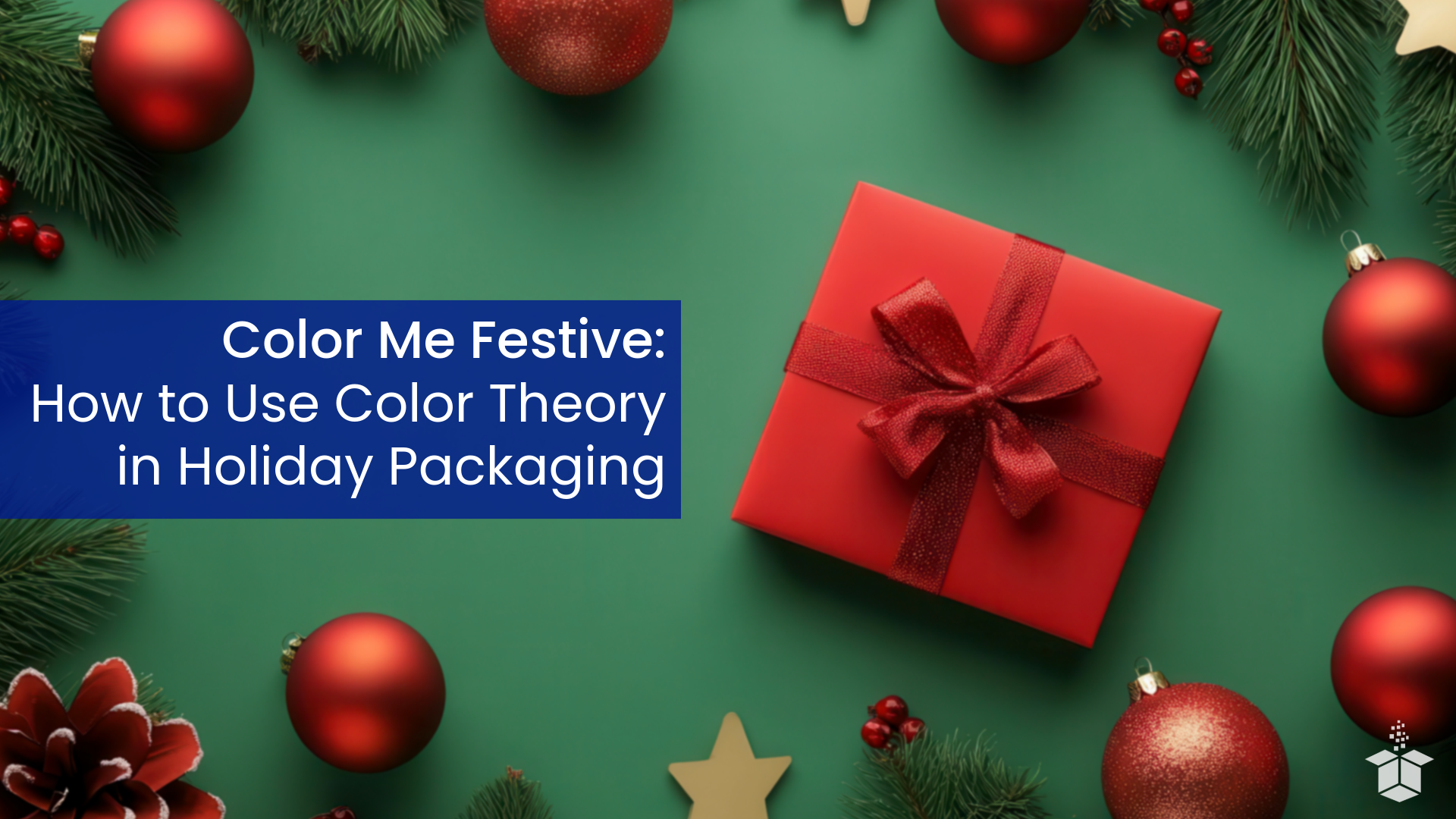
Christmas: Classic vs. Contemporary Cheer
Christmas is the most emotionally loaded holiday of the season, and the colors you choose can tap into deep wells of nostalgia or signal a fresh, unexpected take on tradition. Whether you lean into the classics or aim for a modern twist, color theory can guide how your packaging connects with consumers.
Classic Christmas Palette
Colors: Red, green, white, gold, silver
Psychology: Tradition, joy, generosity, warmth
The classic Christmas palette is instantly recognizable. It evokes everything from Santa suits to evergreen wreaths and sparkling ornaments.
Red brings excitement, passion, and cheer.
Green symbolizes peace, nature, and renewal.
White suggests snow, purity, and winter wonder.
Gold and silver add a sense of luxury and festivity.

Classic Packaging Tips:
Use rich, saturated versions of red and green with elegant finishes like soft-touch coatings or embossing to elevate the traditional look.
Gold foil details on deep red backgrounds can evoke old-world elegance.
Incorporate iconic patterns like plaid, snowflakes, or candy cane stripes for visual familiarity.
Stick with serif fonts, script lettering, and tactile materials like velvet ribbons or textured papers for added warmth.
Best for: Heritage brands, family-oriented products, nostalgic gift sets, holiday food and beverage packaging.
Modern Christmas Palette
Colors: Blush pink, icy blue, mint green, monochrome, rose gold, black + gold
Psychology: Whimsy, luxury, surprise, uniqueness
For brands that want to stand out during the crowded holiday season, a modern palette offers room to play. Swapping out the traditional red and green for pastel or unexpected tones can signal freshness, creativity, and trend awareness.
Blush pink and mint green feel dreamy and youthful.
Icy blues and soft neutrals nod to winter while maintaining a minimalist aesthetic.
Black and gold combinations convey high-end elegance and sophistication.
Rose gold and champagne tones bring softness and glam.

Modern Christmas Palette Packaging Tips:
Try a snowy pastel palette with metallic accents for a whimsical, Instagrammable effect.
Use minimalist layouts with generous white space to keep designs feeling sleek and airy.
Pair modern color choices with geometric shapes or abstract patterns for a forward-thinking vibe.
Don’t shy away from bold surprises like holographic finishes or clear windows with colorful tissue inside.
Best for: Boutique brands, beauty/cosmetics, lifestyle and wellness, influencer-ready gift sets, luxury limited editions.
New Year’s: Sleek, Sparkly, and Optimistic
Core Palette: Black, white, gold, silver, navy
Psychology: Glamour, celebration, clarity, new beginnings
New Year’s packaging is where brands can go all-in on elegance and sparkle. The tone shifts from cozy to cool, from family to festivity.
Black signifies sophistication and formality: think tuxedos and champagne toasts.
White suggests fresh starts and clarity.
Gold and silver offer shimmer, status, and celebration.
Navy and deep blue evoke confidence and nighttime glamour.

Packaging Tips:
Lean into metallics: foil stamping, holographic accents, and glitter inks work especially well for this holiday.
Use clean, geometric layouts with bold typography to communicate modernity and clarity.
Starbursts, sparkles, and ombré gradients can visually represent fireworks and new beginnings.
Consider combining matte black with gloss finishes or metallic details for a dramatic and elegant look.
Best for: High-end goods, party supplies, celebratory gift boxes, limited-edition releases.
Design Principles: Color Theory in Practice
While each holiday has its own visual language, some universal design tips can elevate any seasonal packaging:
Use Complementary Colors
Opposites on the color wheel (like red and green) create high energy and visual interest. Great for grabbing attention, but use in moderation to avoid clashing.
Try Analogous Palettes
Colors that sit next to each other (like red, orange, and yellow) feel harmonious and soothing. Ideal for Thanksgiving or cozy holiday campaigns.
Add Accent Colors
Even classic palettes can be refreshed with a bold or surprising accent. Think neon pink for Christmas or teal for Halloween. It keeps your design fresh without losing seasonal relevance.
Consider Your Substrate
The color of your packaging material (white, kraft, black, etc.) changes how inks appear. Gold foil on black feels luxe. Burgundy ink on kraft feels earthy. Always test for contrast and legibility.
Final Thoughts: Let Color Tell the Story
During the holidays, packaging becomes more than just a vessel. It becomes part of the experience. Whether you’re playing into tradition or rewriting the rules, thoughtful use of color can make your product feel like the perfect gift, even before it’s opened.
Remember: colors don’t just decorate your packaging. They define the feeling your customers will walk away with. And during the most emotional, memory-rich time of the year, that’s more powerful than ever.