

How Thanksgiving Packaging Shapes Seasonal Storytelling

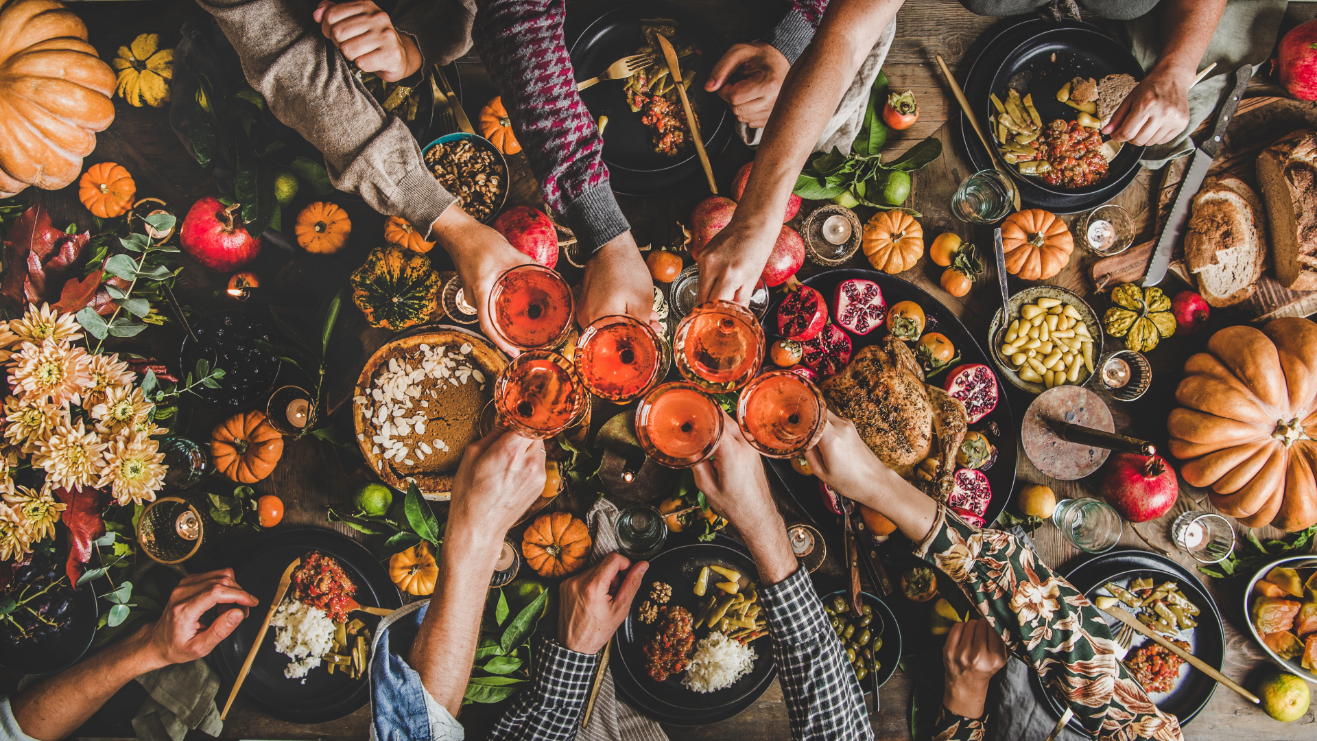
When you think of Thanksgiving, you probably think of turkey, food, more food, family, and football. And while we are with you there, Thanksgiving comes down to connection. Gratitude, Tradition. And for brands, it’s an opportunity to tell a story that feels warm, heartfelt, and human.
While most people think of storytelling in terms of ads or social media, packaging plays just as big a role, especially during the holidays. It’s the first thing customers see when their order arrives or when they pick something up from the shelf. And during Thanksgiving, that first impression can instantly spark feelings of comfort, nostalgia, and generosity.
So how does packaging become part of the Thanksgiving story? Let’s unwrap it.
1. The Emotional Side of Seasonal Packaging
Packaging around the Thanksgiving holiday isn’t about overloading designs with pumpkins and turkeys. It’s about emotion. The best brands know how to evoke a feeling rather than just decorate a box.
Warm tones, soft textures, and thoughtful messaging can create an experience that goes beyond the product inside. When a customer sees a fall-inspired package, it’s not just a seasonal change. It’s an invitation to slow down, reflect, and appreciate.

For example:
A candle brand might use deep amber tones and rustic paper textures to convey coziness.
A bakery could wrap pies in Kraft boxes sealed with burnt-orange labels that say, “Made with gratitude.”
A coffee roaster might include a small card sharing a message of thanks to its customers for another year of support.
These small details turn packaging into a moment of connection, a physical reminder that even in the busiest season, gratitude matters.
2. Designing Gratitude: The Power of Visual Cues, Messaging, and Experience
Thanksgiving is one of the most emotional times of the year, and your packaging is an extension of that sentiment. The right combination of visuals, words, and experience can turn an ordinary box into something that feels personal and memorable.
Visual Storytelling

Color, imagery, and typography are silent storytellers. They set the tone before a single word is read. Thanksgiving packaging often leans into earthy color palettes, burnt orange, deep gold, burgundy, olive green, and warm neutrals. These hues naturally evoke comfort and abundance.
Beyond color, illustrations and textures can also tell a story:
Subtle leaf patterns, hand-drawn sketches, or linen-like finishes suggest warmth and craftsmanship.
Metallic foils in bronze or gold can add a touch of celebration.
Fonts with a handwritten or serif style evoke nostalgia and tradition.
Together, these elements create a visual language that tells your customers, “This brand understands the season and how it feels.”
Gratitude in the Details
Thanksgiving is built on gratitude, and packaging is a perfect place to express it. Adding a thank-you message, seasonal greeting, or small gesture of appreciation shows customers that your brand values them.
Some simple ideas:
A printed message inside the box lid: “We’re grateful for you.”
A thank-you insert signed by your team.
A QR code linking to a short video message or playlist for cozy fall vibes.
When customers feel appreciated, they’re more likely to remember your brand long after the holidays are over. Gratitude builds connection, and connection builds loyalty.

The Unboxing Experience
Thanksgiving is all about moments, sharing food, telling stories, and spending time together. The unboxing experience can capture a piece of that same feeling.
Imagine a customer opening their order to find:
Warm-toned tissue paper instead of plain white.
A hint of cinnamon or vanilla from a lightly scented insert.
A note that says, “We’re thankful for your support this season.”
Those sensory touches make the unboxing feel like a gift, not just a delivery. It’s a way to pause in the rush of the holidays and say, this moment matters.
3. Crafting a Sense of Home
Thanksgiving is one of the most emotional holidays of the year. People crave familiarity, comfort, and a sense of belonging. Packaging that reflects that can make your brand feel like part of the tradition.
Think about what “home” looks and feels like:
It’s cozy textures, handwritten notes, rustic details, and a little imperfection that feels authentic. Brands that can translate those sensations into packaging design are the ones that resonate most.
For example:
A small jam company might wrap jars in gingham-patterned paper with twine and a “From Our Kitchen to Yours” tag. It’s simple, but it feels personal.
That kind of storytelling doesn’t just sell a product. It sells a feeling.
4. Limited Edition Designs That Feel Like Keepsakes
Thanksgiving packaging doesn’t have to be complicated. It can be special simply because it’s temporary. Limited-edition packaging taps into the psychology of rarity and nostalgia.
Think of it as your brand’s way of marking the season. Whether it’s a fall-inspired sleeve, a special sticker, or a short-run printed box, seasonal variations give customers something fresh and collectible.

For example:
A chocolate brand might release a “Harvest Collection” box with copper foil leaves.
A skincare brand might swap its standard packaging for matte bottles in deep rust tones for November.
A local coffee shop could offer Thanksgiving blend bags with cozy autumn illustrations.
When customers see that kind of attention to detail, it shows that your brand celebrates the season with them. And for many, those limited designs become part of their holiday ritual.
5. Brand Consistency with a Seasonal Twist
It’s easy to get carried away with holiday designs, but the key is to stay recognizable. Thanksgiving packaging should feel festive without losing your core identity.
A simple rule of thumb:
Keep your brand elements (like logo, typography, and structure) consistent, and layer seasonal design details on top.
That way, your Thanksgiving packaging still tells your brand story… just dressed up for the holiday table.
For instance:
If your brand is known for minimalist design, you might add subtle copper foil accents instead of busy patterns. If your packaging usually uses bold colors, you might tone them down with a fall-inspired secondary palette.
The goal is to enhance, not replace, your brand’s visual language.
6. Telling a Shared Story
One of the most beautiful parts of Thanksgiving is that it’s collective. It’s something everyone experiences in their own way, yet together. Packaging can echo that.
Maybe your packaging features artwork from local artists inspired by gratitude. Or maybe it shares customer stories about what they’re thankful for. Interactive packaging, like QR codes or hashtags, can even invite customers to join the conversation.
When your packaging becomes part of the shared cultural moment, it stops being just a container. It becomes a connection point.
7. Turning Seasonal Stories into Lasting Impressions
The real power of Thanksgiving packaging isn’t limited to November. It’s what it represents: warmth, gratitude, and connection.
Brands that master seasonal storytelling through packaging tend to see that emotional connection carry into the rest of the year. Customers remember how your brand made them feel, and that’s what keeps them coming back.
Whether you’re designing limited-edition packaging, adding a thank-you insert, or reimagining your brand’s fall color palette, your Thanksgiving packaging should say something more than “Happy Holidays.” It should say, “We’re part of your story.”
Final Thoughts
Thanksgiving packaging isn’t just about aesthetics. It’s about empathy. It’s about understanding how customers feel during this time of year and designing something that reflects that warmth and sincerity.
When you tell a story through packaging, you’re not just wrapping a product. You’re wrapping an emotion. And that’s what turns seasonal customers into lifelong fans.