

From Shelf to Sunshine: Is Your Packaging in Season?
There’s something about summer that changes how people interact with products.
They’re outside more. They’re traveling. They’re moving faster, buying more impulsively, and paying closer attention to what feels fun, fresh, and in the moment. It’s a season built on energy, and your packaging plays a bigger role in that than most brands realize.
Because here’s the truth: Even if your product hasn’t changed, your customer’s mindset has.
And if your packaging still feels like winter, or even early spring, you’re already slightly out of sync. But that doesn’t mean you need to start from scratch. A full redesign isn’t always realistic (or necessary). The smartest brands know how to make strategic seasonal shifts: small, intentional changes that instantly align their packaging with the feeling of summer.
So the real question isn’t “Do we need new packaging?” It’s: “Does your packaging look like summer?”
What “Looking Like Summer” Actually Means
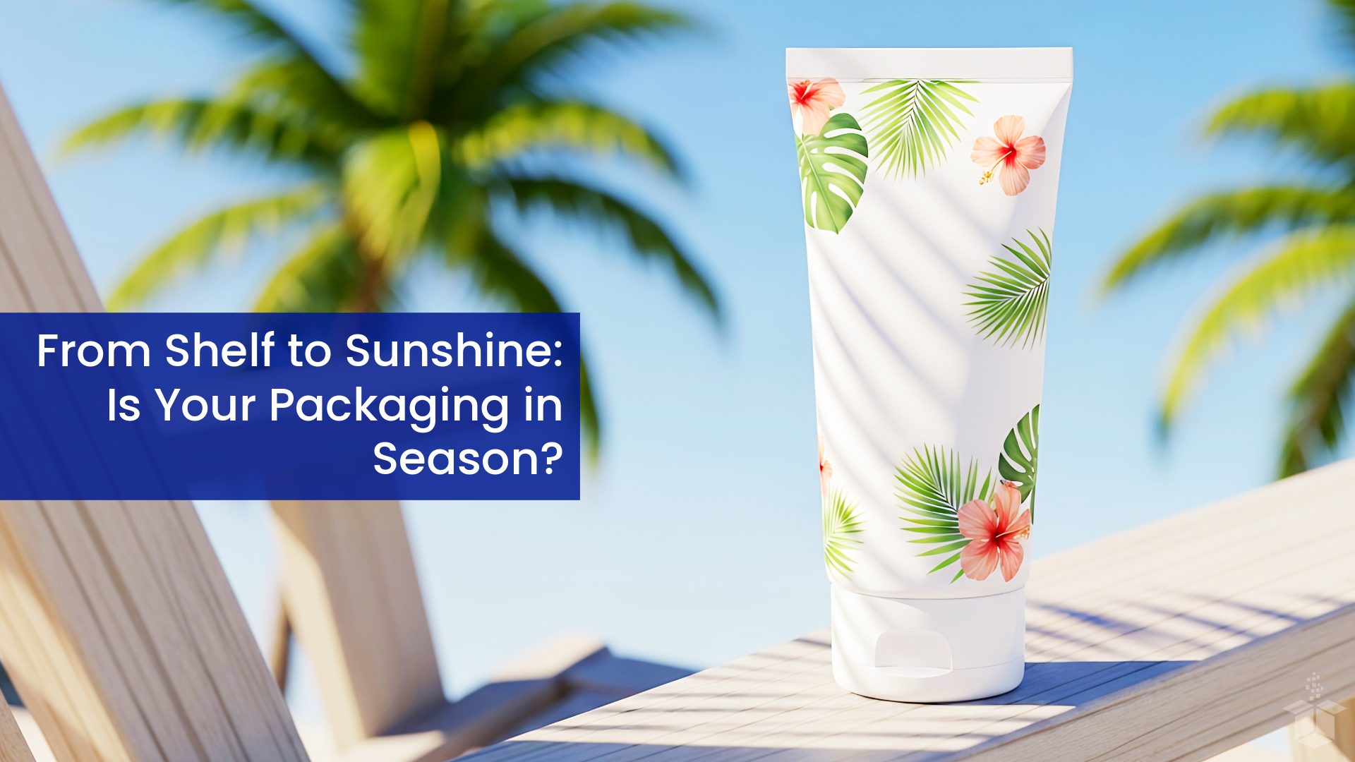
Summer packaging isn’t just about throwing a palm tree on a box or switching everything to neon. It’s about capturing a feeling.
Think about how summer shows up in real life:
Bright, natural light
Longer days and lighter moods
Heat, movement, spontaneity
Travel, outdoor settings, and social moments
A mix of relaxation and energy
Your packaging should reflect some version of that. Because when it does, it feels timely. Relevant. Easy to connect with. And when it doesn’t? It feels just slightly… off.
Color: The Fastest Way to Shift the Season
If there’s one lever that instantly changes how packaging feels, it’s color. Summer color palettes tend to fall into a few recognizable directions:

Bright and Playful
Citrus tones, saturated blues, bold pinks… colors that feel energetic, youthful, and built for attention.
Light and Airy
Soft pastels and sun-washed tones that feel breezy and relaxed.
Nature-Inspired
Greens, sand tones, ocean blues, all grounded but still seasonal.
High Contrast Summer
Bold brights paired with black or crisp white for a more modern, standout look.
The goal isn’t to chase trends. It’s to make sure your current palette still feels aligned with the moment.
Simple ways to shift color without a redesign:
Swap background colors while keeping branding intact
Introduce a limited summer color variation
Adjust accent colors (icons, borders, highlights)
Add seasonal sleeves or inserts
Even small changes can completely shift perception.
Texture: The Underrated Summer Signal
Color gets attention. Texture creates experience. And summer has a distinctly lighter, more tactile feel.
It leans away from heavy, overly polished finishes and toward materials that feel natural and effortless.

Textures that feel like summer:
Uncoated or soft-touch finishes
Matte over high gloss
Subtle embossing or debossing
Lightweight materials
A heavy, glossy package might feel premium in colder months, but in summer, it can feel out of place.
Here are some easy texture updates:
Switch coatings (gloss to matte or soft-touch)
Introduce textured labels
Use different insert materials (kraft, recycled, linen-style)
Add a secondary tactile element like a band or tag
These changes are small but they influence how your product is physically experienced.
Smart Seasonal Refreshes (Without Overdoing It)
Seasonal packaging works best when it feels like an evolution… not a complete reset. The strongest brands don’t abandon their identity for summer, they adapt it.
That might look like:
Modular designs that allow certain elements to shift seasonally
Layered packaging (outer vs. inner) where only part of the experience changes
Subtle seasonal cues instead of heavy-handed themes

Because consistency still matters.
If you change too much, you lose recognition. If you don’t change at all, you risk feeling static. The balance is where the magic happens. But this is also where brands tend to miss the mark.
Seasonal updates can quickly go sideways when:
The design leans too literal or theme-heavy and feels gimmicky
The packaging looks seasonal but isn’t built to handle heat, travel, or outdoor use
Too many elements change at once, creating confusion or operational strain
The design ignores how and where the product is actually used in summer
Good seasonal packaging doesn’t just look right. It functions in the real world your customer is in.
Designing for Summer Moments
One of the most effective ways to approach seasonal packaging is to think beyond aesthetics and focus on how your product is used.
Because summer isn’t just a look. It’s also a series of moments.

On-the-go & travel
Packaging should be lightweight, durable, and easy to carry.
Outdoor environments
It should withstand heat, sunlight, and movement.
Social sharing
This is peak season for user-generated content. Visual appeal matters more than ever.
Gifting & gatherings
Small seasonal touches can make packaging feel more thoughtful and timely.
When you design with these moments in mind, your packaging naturally starts to align with the season without forcing it.
Final Thought: It’s About Staying in Sync
Seasonal packaging isn’t about chasing trends. It’s about staying connected to your customer.
Your product exists in real environments, real seasons, and real moments. And when your packaging reflects that, it feels intentional.
The good news? You don’t need a full redesign to get there. A shift in color. A change in texture. A small seasonal detail.
Those subtle adjustments are often enough to take your packaging from feeling slightly out of place… to feeling exactly right for where your customer is right now.
And in summer, that means something that feels just a little brighter, lighter, and more alive.